Cabinets of Mischief 2021, Germany, Weimar
Check-point Pavilions on the Road through Gotha's Heritage
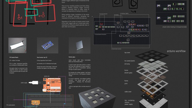
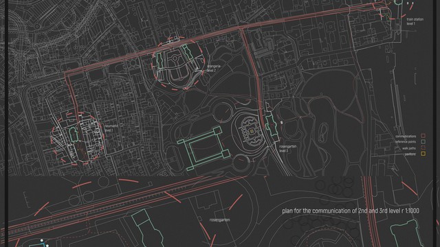
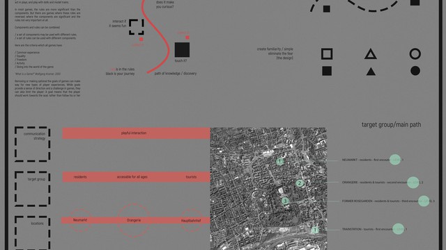
Analogous to the mapping of memories and brain paths, our project aims to map out stories and historic paths of Gotha and Baroque. It references the gameplays of both exploration and classic puzzle games and recontextualizes them in the form of three pavilions strategically placed inside the city. Interactivity is vital, and we invite onlookers to connect their memories to those of Gotha. In other words, our cabinets mimic the experience of a person watching a movie, TV show, or theatre play, in which the emotional connection allows the spectator to relate to the 'text' and remember it without effort.
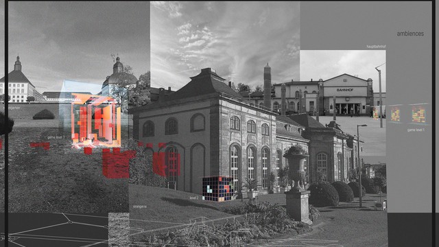
We determined three main goals that permeate our whole project: eliminating borders, creating playful paths to knowledge, and retaining the familiarity and simplicity of the design. First, considering the museum and its building as an intimidating presence for most people, we decided to bring the collection outside and avoid enclosed spaces, providing transparency and accessibility. Second, we wanted to engage visitors and make them curious about the exhibition without forcing them to memorize information just for the sake of it. Out of this came our concept of creating an interactive experience of following a playful path through Gotha. The decision to have multiple checkpoints in the city is directly related to this. Lastly, when thinking about the design, we decided to keep it simple and familiar with the goal of eliminating any fear. For this reason, we chose to reference the familiar experience of playing simple puzzles or clue-searching games and engage people of all ages and backgrounds. In practice, our game is without obstacles. The goal is to obtain information on one particular object of the collection through three different levels and locate it inside the museum. There is no difficulty in it, and the idea is that, through the partial uncovering of the object, players create an emotional connection with it. There is no obligation to start a game at the first level, however, to encourage visitors to complete all three levels, we offer a free audio guide or photo bracelet for the museum and castle as a reward. Additionally, a walk-through leaflet is offered at each pavilion. To achieve this, we designed three levels(pavilions) of 'the game' positioned at four important spots within Goth and in critical locations for tourists and residents. Each level provides a more immersive experience, drawing visitors deeper into the history and exhibition of Gotha's Baroque universe. Finally, the pavilions are designed to wrap around the existing structure of the city and maintain a connection between the people and surroundings. The design is flexible and adaptable, allowing alternate locations and paths for different experiences.
https://tinyurl.com/cabinetsofmischief
Poster
Details
Team members : Katarina Bankovic, Katharina Fuchs
Supervisor : Prof. Bernd Rudolf, Prof. Andreas Kastner, Junior-Prof. Reinhard König, Dr. Sabine Zierold, Nazar Abuhalaweh
Institution : Bauhaus-University Weimar
Descriptions
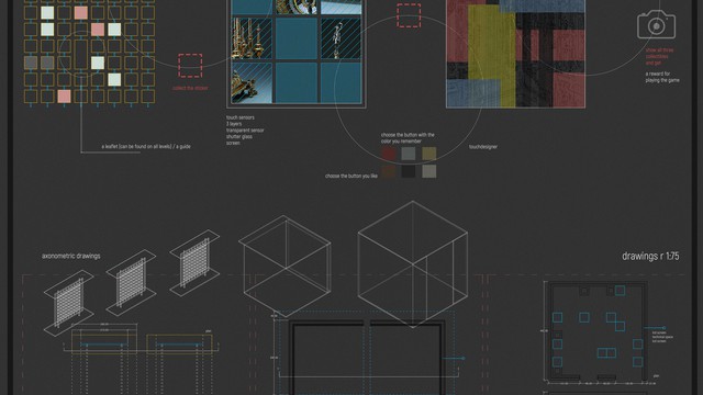
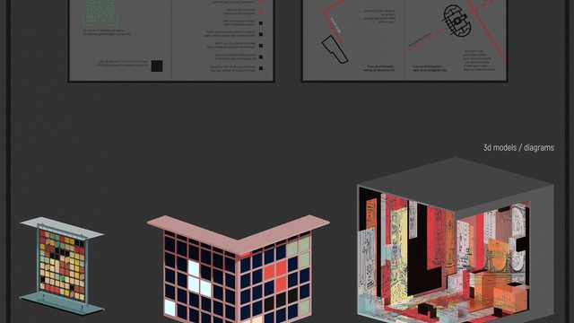
Technical Concept : With the idea of increasing the level at which the player is immersed in Gotha's universe with each step, we decided to use different media for every pavilion/level. The first pavilion is completely mechanical, and we use a metal frame and wooden plates that flip around to create a game of color association and search for clues. For the second pavilion, we used Arduino to create a puzzle game that reveals the visual details of an artifact. This pavilion consists of an LED screen obscured by shutter glass, which unveils the screen behind by the touch of a hand on one of the touch sensors. The last pavilion, with the help of touchdesigner, drags the player into the world of Baroque - with a cube that consists of LED screens and visuals that are influenced by the movement and position of the player, disclosing the last clues about the artifact.
Visual Concept : The artifacts of the exhibition are 'taken out' of the museum in the medium of an image and textual facts of their origin, materials, or usage. Color coding and square-like patterns are important aspects of the entire game: they create repetition and familiarity. At the first level, the player chooses the color of the artifact that they are most curious about. Later, they use the same color (by pressing buttons) to instruct the other two pavilions to reveal the story of the same artifact. At the second level, the image of the object is shown only partly in the form of a collage of details, which reveals information on the materials used. At the last level, the scale of the 'square pattern' is the largest and the player is presented with an interactive cube. Inside the touchdesigner, the image is distorted, while the visitors influence it by moving around or sitting on the smaller cubes.
Credits
Katarina Bankovic, Katharina Fuchs
Katarina Bankovic, Katharina Fuchs
Katarina Bankovic, Katharina Fuchs
Katarina Bankovic, Katharina Fuchs
Katarina Bankovic, Katharina Fuchs
Katarina Bankovic, Katharina Fuchs
Katarina Bankovic, Katharina Fuchs
Katarina Bankovic, Katharina Fuchs